design concept
Turning Twitter’s Feed on its Head
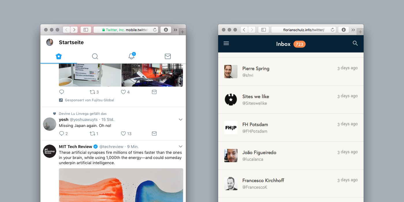
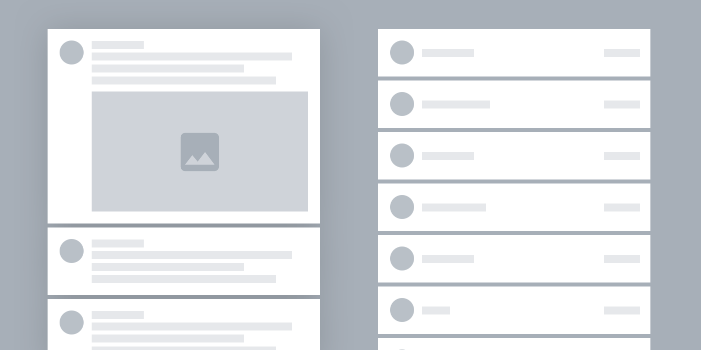
Twitter and Facebook use infinite news feeds to display content. Seemingly simple, somewhat chronologically ordered, but algorithmically prioritized content of people, companies and news organizations you follow. Prioritizing and promoting content based on “relevance” is an attempt to handle the sheer amount of information being posted.
For example, the more you interact with someone or the more someone posts, the greater the chance that their tweets show up at the top of your news feed. People you never interact with or who post once a month are likely to be unseen and lost forever. Out of sight, out of mind.
Besides the filtering, the core idea still is: what’s new is more important. The newer something is, the higher up it appears in the feed. Nothing more boring than the news from yesterday. Or the last hour.
But wasn’t this supposed to be a social network? Something about people and keeping in touch? Unfortunately, it’s impossible to catch up when you are flooded by tweets, retweets, news, and spam and have no sense of start and end.
Let’s rethink the design.
Inbox everyone
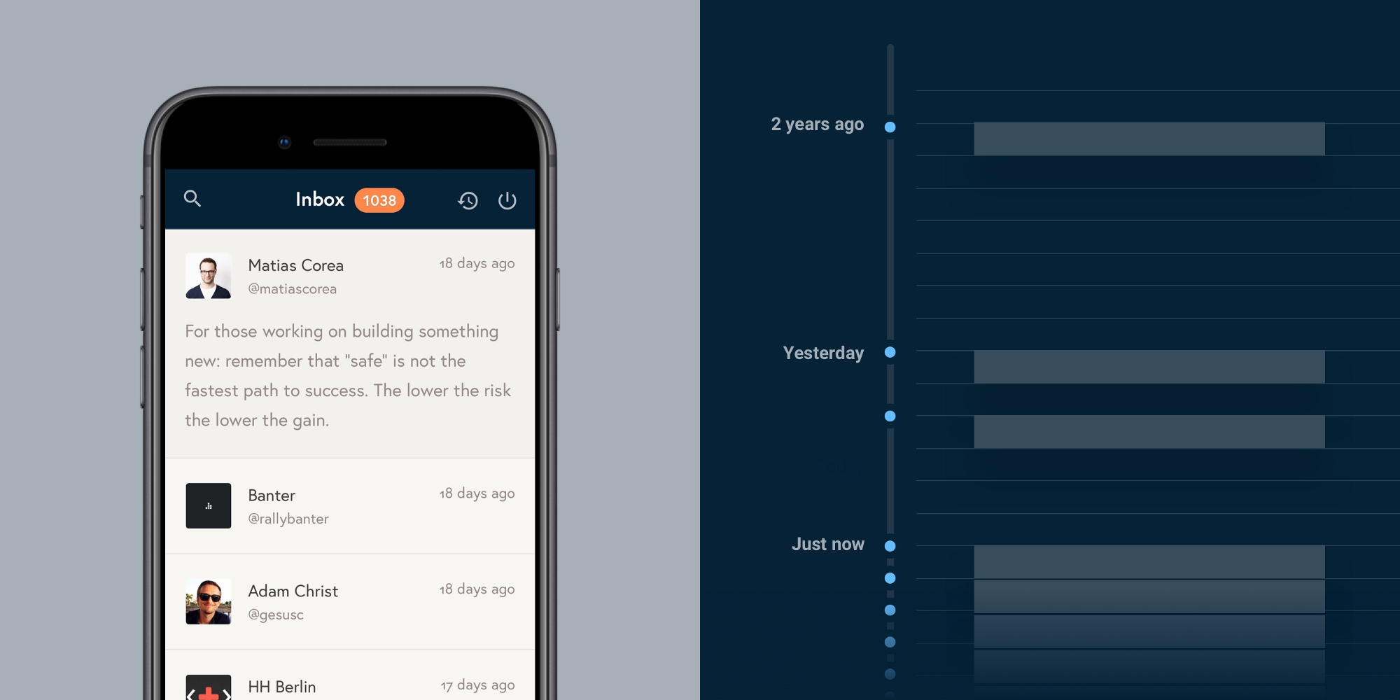
Let’s hide all content from the feed. Let’s display all the people you are following. A complete list of all the people you are interested in. Name, avatar, date of last tweet. That’s it.
Reverse order
Now, instead of designing this as a news feed with the latest news on top, let’s reverse the order. Someone who tweeted a month ago is shown first, someone who just tweeted, all the way down at the bottom. In my case this revealed a few people who last tweeted 7 years ago.
Archive
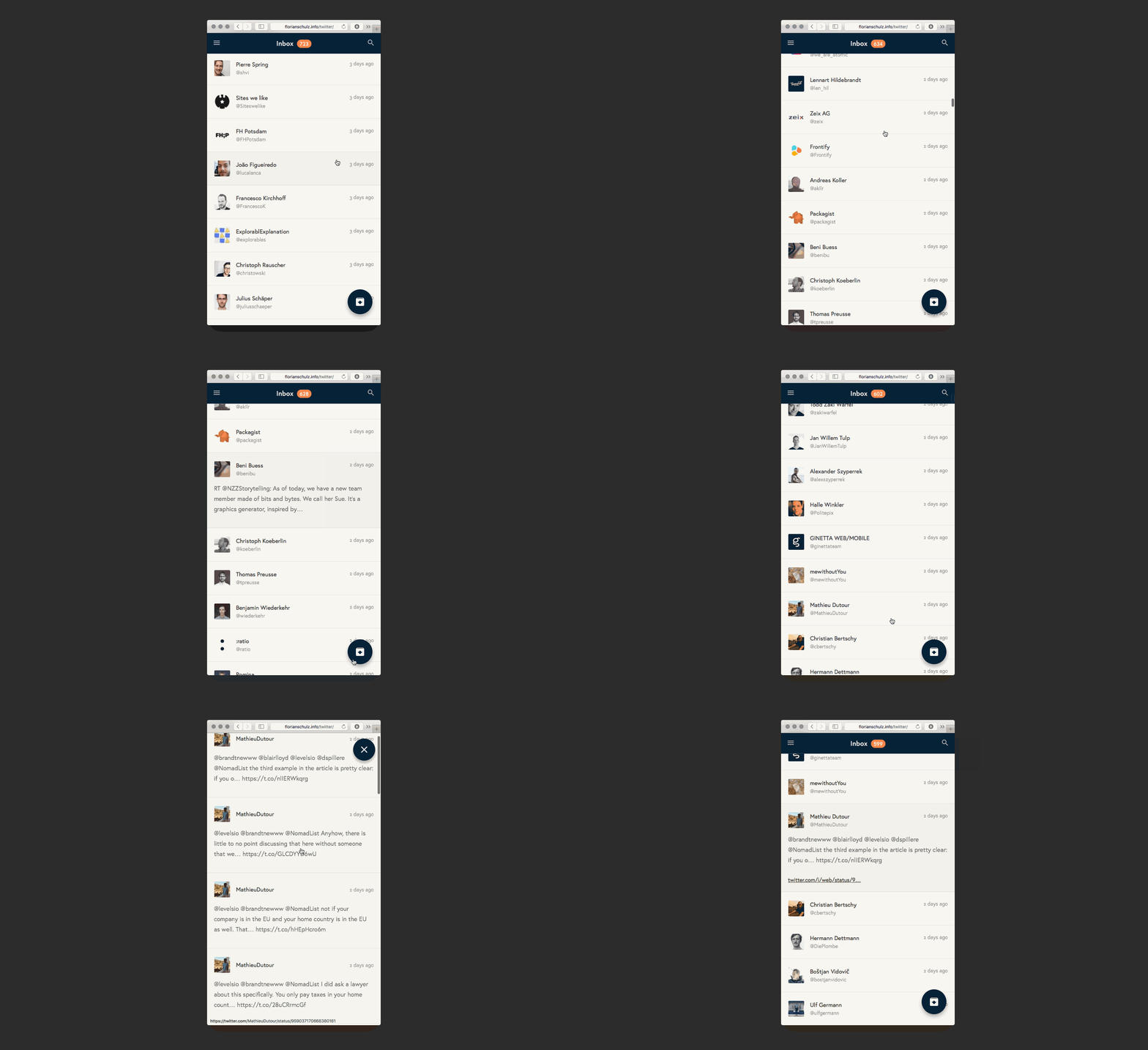
Since we display all the people you are following, this would result in a very long list, and the old tweets you’ve already seen would always stick at the top. That doesn’t make sense. That’s why common news feeds don’t work this way.
But: While scrolling past people, we can mark them as “seen” and hide them until they post something again. A timestamp becomes the single filter that defines what we see or don’t see.
Time to catch up
Instead of hunting for the latest and greatest news, we now have a design that makes sure that every single person we’re following can be seen. Now, it is our choice to skim and scroll past them. It is our choice to tap and actively view the content. We are no longer distracted by images, animated GIFs or ads. Instead, we are driven by people and our interest in what they had to say — even if that was last week.
Back to the roots
By hiding retweets, favorites and replies, the design puts emphasis back on the original thoughts that people shared with the world, valuing the rare moments that people took time and energy to write something of their own. Likes and retweets can stay in the fast food feed.
Unfollow
Now, you may stumble upon people who haven’t appeared in your feed in a while, you may find that some of them are not interesting to you anymore. Such an interface makes it easy to unfollow them on the go. A nice side effect.
Why is this better?
-
You won’t miss activity from people who rarely tweet. Tweeting less doesn’t mean the content is not worth seeing. If people you care about say something, it matters.
-
People who tweet a lot will still show up, but never multiple times. They get one slot like everyone else. News organizations and other high frequency accounts will always be around, but not outrank the people who tweet once in a while.
-
It’s you doing the filtering, not the algorithm. By seeing the faces and names of people, you are likely to only look at the ones that seem relevant at this moment in time. Interested in tech? Look at the people you know work in that field. Interested in politics right now? You might look at other accounts instead.
-
Other than with the infinite scrolling feed, this design provides a clear start and end. We can explicitly display the number of accounts that you haven’t looked at. Transparent and finite.
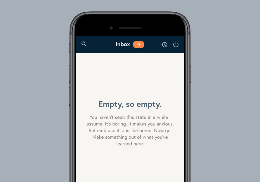
But isn’t this… stressful?
You might think that this design would make you want to look at every single person’s recent tweet in order not to miss anything. Or to scroll to the bottom to see the most recent news. If you follow hundreds or thousands of people, yes, that would be a lot of work. But here’s the thing: by hiding distracting content and focusing on people, this design doesn’t entice you to look at everything and instead encourages you to choose consciously. I think that Twitter should not just be about news. It should also enable you to see what friends and colleagues, who are neither hyper active nor famous, share with the world.
Demo
Want to give it a try? Sign in with your own Twitter account to explore this concept. You can view all your followers, read their most recent tweet and tap into their timeline to read more. The site also remembers where you’ve left off, so that next time you visit, you can continue at the same point in time.
👉 https://www.florianschulz.info/twitter
Conclusion
I don’t see this as the one and only view that is better than a personalized feed. But it is another way to look at content. Maybe users could choose their own priority: be it latest news, or the things people had to say. The latter may be more work and less entertaining. But it might be more meaningful and helpful to stay in touch with the people we chose to follow.